Postby Walter Glover » 03 Oct 2021, 14:19
Apologies for taking a while to post this information but as you’ll soon gather I wanted to check the accuracy of what I was suggesting with a mate whose brother runs a prepress house.
WORKSPACE
So to begin at the beginning, long before we get to Internet algorithms there are certain considerations that only you can make about how and where you intend to publish and distribute work.
1. Before anything: Is your system calibrated to industry standards? Is the monitor showing what the other output devices will reproduce?
2. What colour space will you work in? If, like me, your purpose is high-end output to industry standards you will need to work in the colour space AdobeRGB. This should include thinking on your own inkjet printer.
3. Most services on the Internet like this forum and Flickr or InstaGram are in the colour space labelled sRGB. sRGB has a much smaller gamut than AdobeRGB so the tonal value differences between the two will be significant.
In all the years that I had to concern myself with digital output and delivery, whether starting from film and scanning or digital capture, I have only ever functioned in AdobeRGB. Loading or displaying work on the Internet has always been very much a secondary purpose and so to conserve storage space and avoid confusion I’ve only ever archived in AdobeRGB. Beyond commercial considerations, I don’t go to the cost and effort of shooting large format to wash the quality down the toilet just for the sake of the Internet.
WORKFLOW
(this applies to scanning negatives or transparencies if you’re using a digital camera to copying negative one a photograph of photographic print I have no idea about procedure)
I scared everything doing up is in 11 x 14 print 360 dpi (dots per inch) because when I had a printer it was an Epson and mathematically the print head of an Epson is ideal at 360 dpi. Other printers such as Canon require 300 dpi. Delivering files to labs and/or clients also requires 300 dpi as a standard.
So that brings us to scanning resolution:
Negative Size Resolution
(ppi pixels per inch)
10 x 8 600
5 x 4 incl 6 x 12) 1200
120 2400
35 mm 3200
On my trusty old Epson 4990 I scan using the native software (not Silver Print etc) and the plastic film holders for everything up to 4x5 and for larger I use the film guide.
I scan as COLOUR TRANSPARENCY film (even if B&W neg) in 48 bit which results in 16 bits per channel RGB. I save as a TIFF and work as 16 bit TIFF through the entire imaging process.
I apply no sharpening, dust busting or tonal/exposure correction at the scanning stage. It is done with far greater control in your imaging software. (having said that I have absolutely zero knowledge of Gimp)
OUTPUT
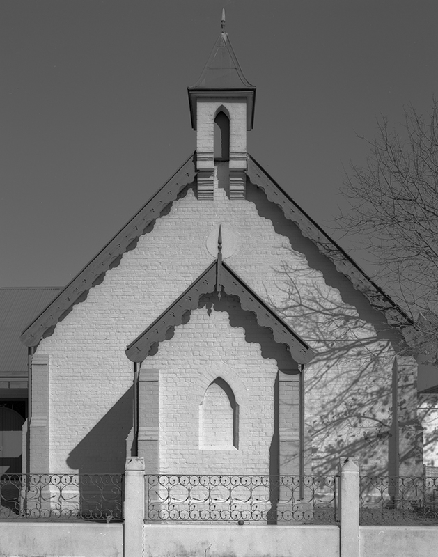
I have only ever used PhotoShop and a little bit of LightRoom so, knowing that you don’t, I’ll refrain from running through procedures. But having gone to the details preamble we can jump to the original points raised on the two renderings of the bushland white church:
PRINT TONE TONAL VALUE
Featureless White [ZONE X] 255
First Feature White [ZONE IX] 248
Middle Grey [NOT ZONE V] 128
First Feature Black. [ZONE I] 9
Featureless Black 0
Let me repeat that the numbers in the RH column will be different in sRGB
Lighter White Church
the inset in the front peaks around 222
The open shadow to the right gets as low as 81
The shadow under the guttering gets as low as 5
Walter Glover
"We see things not as they are. We see them as we are."
— Emanuel Kant