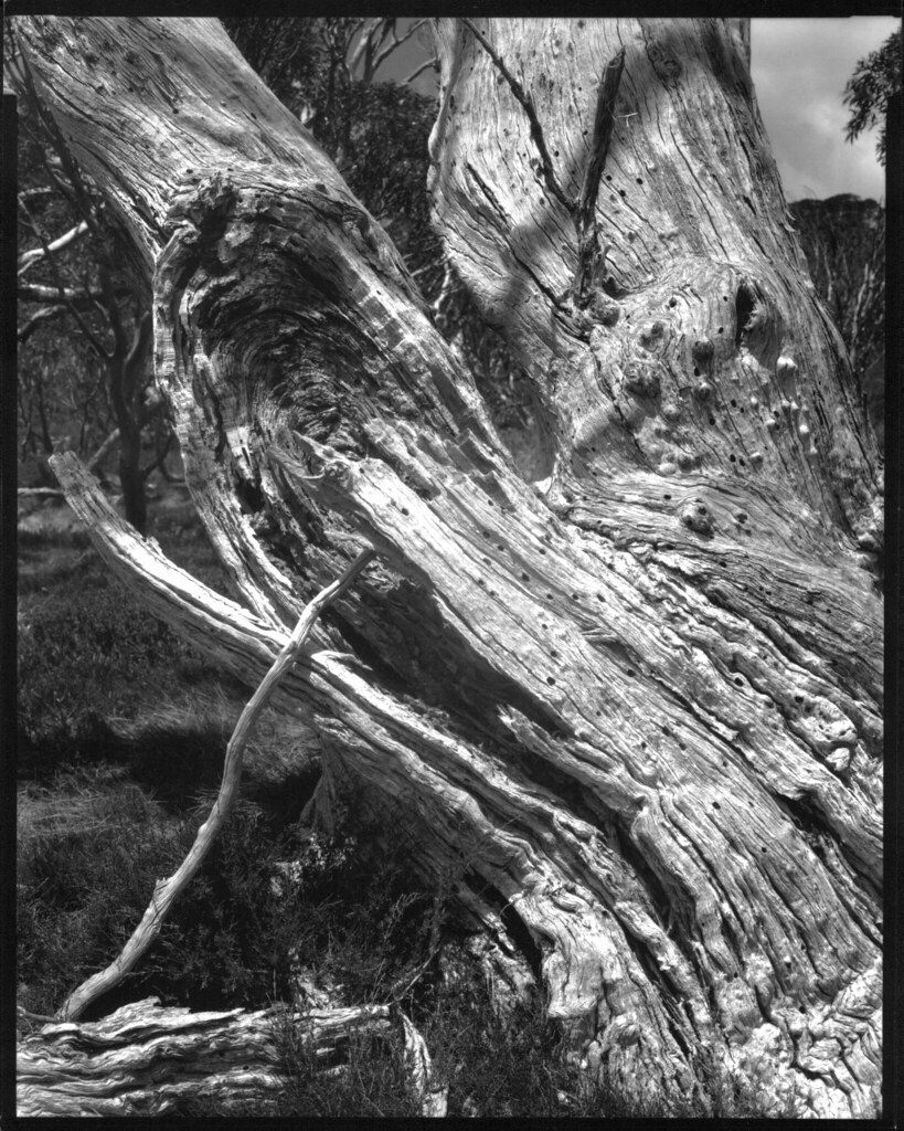
Bleached Wood, Snow Gum Grove
Gelatin-silver photograph on Freestyle Private Reserve VC FB photographic paper, image size 24.7cm X 19.5cm, from a 8x10 Fomapan 200 negative exposed in a Tachihara 810HD triple extension field view camera fitted with a Fujinon-W 300mm f5.6 lens.